Showing posts with label art process. Show all posts

Friday, February 21, 2020

Man Cave Art - The Bourbon commission story

A good friend and collector referred her sister-in-law in Florida to me to create something for her hard to buy husband.  She emailed me ideas initially, then we had a phone conversation where she told me a bit about him, what he likes, and where she envisioned the piece going.  I also like to have clients go through my website and tell me what pieces they love, ones they hate, so I can get an idea of the type of work they like.  His "office” housed his bourbon collection and tables made from old barrels.  He loves bourbon and so her thought was to incorporate one of the collectible Blanton corks into the piece somehow.

I asked her to send me some pictures of the room, and there was lots of wood, black accents, and little burgundy leather-a very masculine feel. Walls were light beige so the piece had to be darker to contrast it and show up. A plan started formulating in my mind….. I related it to my client, and she liked all the ideas.  Those things she wasn't sure about- she said- "you're the artist!" and gave me the freedom to make some decisions along the way. I have to say a vote of confidence like that goes a long way in keeping a positive approach to a commission, which is always harder than work you make for yourself. In my experience- those pieces turn out best!! So I emailed a contract, listing all the things we had decided on, she signed it and sent me half to get things started. 


So the front of the piece would have the cork, and logos for the two types of his favorite bourbon. Columns of numbers to represent his accounting background run throughout, and we had agreed to leave some wood surface exposed to relate to the bourbon barrels, and also all the wood in his office/man cave.  The hobbies  and childhood home address would be relegated to the sides of the piece, supporting but not as important as the bourbon!!!  Since we wanted to have some wood show, I opted to work on the raw wood with watercolor, staining the wood, but still transparent enough to see the grain.  The concept dictated the medium here!  So did some tests to try out the palette and transfers on wood. 


Next step was researching images that weren’t provided for me, and spending as much time as needed in photoshop scaling them and playing around with the alignment on the piece.  I like to “audition” the images on transparencies before committing them to the surface.


So I learned a lot about bourbon during this.  I did some research on the barrels themselves, and those guys who make them are expert artisans/craftsman! The strips that make up the barrels are called staves, and they’re aged outside, and then they carefully assemble the whole damn barrel without any glue, screws, or nails because that  would affect the flavor of the spirit aging inside. I also learned that they torch the barrels to caramelize the sugar’s in the wood. So..... that gave me an excuse to use my blow torch! Corners of the piece are torched and singed. The simulated staves I initially inked in, but that wasn’t enough so I went back and gouged them in and then re-inked them so they look like separate panels.. Then there were the “hoops” or black metal strips on the outside of the barrel holding it together.   I dug through my supplies and found an old etching using grays from a metal plate. It’s beautiful. I added paint and inks as needed, then sealed the heck out of it. I searched for brads the perfect size to simulate the "Stave Grommets"(as I learned they are called), and positioned them as they are on a barrel.


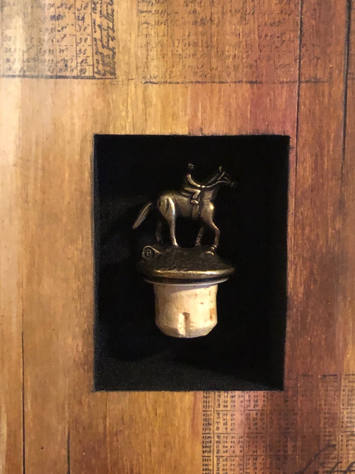
And then there was the niche to hold the cork. I wanted the cork to “float” (or appear to) in the niche.  I wanted the interior to contrast the texture of the smooth wood. They use flocking to line boxes of things that are precious or important, so I thought it worked for the piece compositionally  and meaning wise as well. However, getting a metal rimmed object to securely float on a flocked surface was challenging. There’s always some sort of unanticipated challenge!   But this is one of these times when I am very happy that I have a million tools and materials in the studio to tackle just about any situation that crops up!!  


So normally at this stage of the game I invite my patron over to the studio, and we unveil the new piece and drink a toast to the artwork. Since this was long distance, I had to figure something else out- and I wanted to make sure she was thrilled with it before shipping it out.  My friend (clients sister in law) came over and we did a long distance video unveiling with the client, and she thought it was “fricken awesome”!  And then- we had a glass of bourbon to toast!  That is one of the best parts- delivering a piece that the client is thrilled with.   So far, I've never had a client that wasn't thrilled with their piece!!

Below are some shots of the finished piece.....


Thursday, September 17, 2015

Flock o' Geese ATCs


Sometimes while working and focusing on one piece, it will overlap or flow into another.  Sometimes its just a practical thing- using up the end of a palette- but often times its because you didn't say everything you wanted/needed to in one piece.  I think a little bit of each happened here. While working on a portion of the large project I’ve taken on (see Midwest Shrine),
http://holzstudiosampling.blogspot.com/2015/04/planning-for-next-big-thing.html

 I shaped a portion of Aldo Leopold's book, "Sand County Summer” into 2 gothic shaped doorways. As I was carefully screening them on, I was reading the text about flocks of geese arriving in the spring.


Totally not planned,  the text ended up on the ATCs because I hate to waste art supplies- and I had a fully loaded screen with ink, took a look around- and found a fitting place to deposit it. But then I wanted to see actual geese, not just the text describing them.  So for the small ATCs I was working on, I made a screen of geese in various sizes and positions to include over the text describing their arrival.  Those led me down its own path and imagery, and now love these little guys.  Two have the text in them- then I went a little “goose crazy” and started flying geese into quite a few ATCs….


the beginning....

 the middle..


the end! 


 More examples- before and after staining....


"going with the flow...."


Thursday, September 10, 2015

Irish ATCs

( These were scheduled to be posted while we were in Scotland and Ireland- but Blogger had different ideas. So- a little late but the art remains the same)

As you are reading this- I am now in Ireland!!  It is a big part of my heritage, but I noticed that the closer the trip got, the more my choices became Celtic ones.  I am going to show you what that looks like here! 

Ogham ATCs

I first became acquainted with Ogham characters during my first trip to Ireland almost 2 decades ago. While seeing the Book of Kells exhibition at Trinity College, these intriguing writings just grabbed me for some reason I can't completely articulate. I bought a postcard to remind me of the marks, (no photos allowed!) then found many other examples on various rocks and ruins during the rest of the trip. I came back and did a little research, and although I am not a linguist, this is my best explanation: It is an ancient alphabet whose characters are based on 12 trees. Found throughout  Ireland, archaeologists now think it might have been more widespread than that- because they've unearthed examples in north and south America that also contain examples of it.  At any rate- the following pieces have excerpts from the Book of Ballymote, in which the priests during the dark ages tried to record what knowledge and history they could preserve.  For some reason, in my mind's eye, a line of Ogham finished these perfectly! 


Irish music

And then, of course, there is Irish music.  After having just seen U2 in concert a month ago, I am still reliving that concert via their songs while working at the studio!  So this piece once again started with alcohol inks on encaustic board- a lovely surface for encaustic. 


I added some contrasting pan pastel blue, then wrote in the U2 lyrics that were playing while I worked- a favorite song of mine-  "Walk On"


  (All that you can’t leave behind is not just referring to actual luggage :) I collaged on a little strip from an old fossil book, and then waxed it. I then took a photocopy of some grasses, “auditioned” them on top of the piece, liked how it looked and what it added, so made a silkscreen of it. 


Screened it on, added another layer of wax, and stopped before I went to far!!  


Here is Walk on -performed live at Slane Castle in Ireland. Imagine! 

Slainte!


Thursday, September 3, 2015

Planting Art seeds in the UK

( These were scheduled to be posted while we were in Scotland and Ireland- but Blogger had different ideas. So- a little late but the art remains the same)

In preparing for our trip to Scotland and Ireland, I made a dozen or so ATCs.

For those of you who don’t know, ATC stands for artist trading cards. They are pieces of board or paper that are 2.5” x 3.5,” the same size as a baseball trading card. They are little tiny baby pieces of art that were originally traded, and now ACEO’s- art card editions and originals- are sold as originals or small series of prints.   The intention for mine was to plant them on both “islands” during our trip, giving them to people who I enjoyed or may enjoy a tiny piece of art.  So I thought it fitting while I’m in the UK, I’ll highlight them on my blog!

Magenta Grasses ATC

This first one I started with some alcohol inks, which I am currently in love with. It’s serious-want-to-get-engaged kind of love :)  I am going to need a cabinet storage area soon! Such vibrant colors, quick drying, and have awesome interactions with other materials.  It’s a loose start, but I like the proportions of negative to positive space…


Went a little crazy here…


So I simplified a bit with alcohol and some coarse kosher salt…


Sometimes there is a method to my madness- other times I love just foraging through my collections to see what feels right, making a right brain rather than left brain connection… that's how I happened upon some patinaed copper that worked beautifully with the magenta.  A wee bit of pressed goldenrod balanced the strong horizontal nicely, but still not feeling done….


Added “living in the moment” in white….


But once I added wax I lost the delicate writing. So added some abstract script, highlights on goldenrod and linear pattern with the contrasting white. 


Done, stamped, signed, and ready to be packed for the voyage!


Slainte!


Friday, August 28, 2015

Ireland Inspired Pieces

So I’m back in the states after a wonderful trip to Scotland and Ireland. I spent a lot of time viewing the local landscape, flora, architecture and rock through a camera  lens.  I love being digital- I am not a good photographer, so I take lots and weed through and delete later.  Now home, I took several hours pouring through my 4 million photos, and was dying to use them. So of course, with a show in three weeks, I'm going to try something completely new. That’ll keep things exciting:)  I narrowed it down to a couple photos, had them printed, glued them onto a panel, wrapped the imagery around the edge, and now going to apply wax layers with more texture and Imagery.  There are many more to come, but I started with this bridge on the Dingle peninsula which we crossed at the beginning of a long and winding walk about on a misty afternoon.  


I obscured the water a bit, then pumped up the moss with some green texture. 


 I transferred on a topographical map of the peninsula on the lower left side, and wrapped it around the edge.  added more texture and  stained some of the relief areas.


-and I MAY be done…. 


gonna let it sit for a couple days and see if I still agree…

Thursday, July 23, 2015

The Commission Process Step 5-Imagery and Details: Shirley and Roger

Some parts of the process are exciting and quick- like the pour. But some are slower, more meticulous and exacting.  This week was one of those times.    I spent several hours two days in a row fine-tuning some areas of the painting, adjusting color, eliminating details I didn't like, accentuating those I did. Once I got it to the point that felt right- I the continued on with the next step- the grasses.

It was important to Shirley that the grasses retain their original “straw” color. I was going to use actual grasses- but during the process of attaching them, their color can become obscured, (or scorched by the torch!).  So based on feedback from Shirley on earlier pieces, I opted instead to silkscreen them on.  


I still wanted to use some actual botanicals in the piece, so I chose leaves in their color scheme, some dollar plants, and Queen Anne’s lace to incorporate.  Once again- I am very slow and deliberate about placement.  Composition – or the arrangement/balance of a piece- is very, very important to me.  I spent a good chunk of an afternoon going through my collection of pressed botanicals to find a good range of size and shape, and then laid them on in various configurations.  When I finally thought that I had a good arrangement- I left. ! Yes, I wanted to wait and see if I felt the same way the next day, looking at it with fresh eyes.  The next morning- I made some small adjustments, but went with the plan. Now to attach in the exact configuration I’d decided on!

I have done this process with with the encaustic wax on a smaller scale, but the larger scale here caused a couple of difficulties.  You must heat up the surface before applying wax, and to do so requires the use of a heat gun or blowtorch- both of which will blow all of my fragile and very light arrangements right off the panel!  I take a picture with my ipad so I can refer back to it- but then I weighted down the ones not being worked on to keep them in place while I heated and applied hot wax to attach the leaves or pods or flowers. It took all afternoon to attach them- but they are exactly where I wanted them :)


In the home stretch now- I hope! I think I am clear about the next step- 
but want to take a break and come back and look and see…
Here it is in its present state hanging on a small piece of studio wall painted in Shirley and Rogers colors....