Thursday, July 16, 2015

The Commission Process Step 4- Jumping in! Shirley and Roger

So my panel is finally done and I get to start!  I gesso up the sides of  (2) 30x30 panels, say a prayer to the art gods, and dive in!  (I am working on two of the same size simultaneously).

What’s in my head before I start?  Well based on a rough sketch, I have an idea of where I want to put in the grasses and other botanicals, so I need to consider these areas and what colors would show them up best while working.  Light grasses need a darker background so they don't blend in, so using a shade of their green for that part. Queen Anne’s lace needs a contrasting background, and want to use those. Need to balance all these colors out- with a loose hand…

The process:

Post pour: 

details...


Now comes the sitting and contemplating and “simultaneously considering” all the things that have to happen here.  So some lightening up and editing is needed.  I leave everything to dry overnight, adjusting tilt of panel as needed, then take another look the next day.  Using an absorbent gesso, I erase/lighten/remove some areas.


Then- using pan pastels- I introduce the rust/Indian red color subtly to some areas.   


  Next step- grasses….


Friday, July 10, 2015

The Commission Process Step 3-Practicing the Pour....:Shirley and Roger

So while I was patiently waiting for the custom panel to be built  (or maybe not so patiently), I thought I’d start “practicing” for the pour, or the first step after gessoing. I love and hate pours-they can be so fun, freeing, and immediately gratifying once you are done with the mixing and set up. It’s kind of like painting room-many times it takes longer to prepare the room than to actually paint it. This is definitely the case with pours.  They can be really really fun and beautiful with all sorts of different viscosities of paint and pigment branching and flowing into one another, or they can go really really badly, ending up with one big muddy runny mess.   Or you can leave come back the next morning and everything has migrated to a completely different part of the painting than where you put it initially. So pours are exciting and nerve-wracking at the same time. It is controlled to a certain extent- and the rest relies on instinct and gravity.  At any rate, the following is a video of me doing a pour.  It was preceded by three prior pours, which were less than stellar. Those could not be used due to the many obscenities uttered in the making :) 


I do want to stress that this is the very first FIRST step of many in the process of making a painting.  The next step requires a lot of sitting and staring, nail biting, fretting, and pacing deciding what to keep, what to delete, and what my next step will be.  That, however, would make less than stellar video, so I’ll just give you the fun part here: 


Thursday, July 2, 2015

The Commission Process Step 2-Preparing: Shirley and roger


So while I am waiting for the custom panel to be built, I have plenty to do. I spent an afternoon going thru my inks, paint, and pigments to see if I needed any more- and despite having millions of colors- of course, I did not have exactly what I needed!  So I ordered those.


Then- mixing and matching.  Spent a bit of time trying to match the wall paint exactly not only because it was important to Shirley, but also because I want to be able to mix it into other colors on the piece, and use tints and shades of it.


  Also played around with other color combinations until they felt right. I always try to mix plenty so I don't have to repeat this process in the middle of the painting!  I also painted a large piece of paper their wall color to hang the piece on to get a sense of how it will look on their wall. 


I looked thru my collections, and am very happy that I spent so much time pressing leaves and grasses last year.   I’d be stuck until late summer waiting for the grasses to mature if I didn't have any grasses left! But I have enough to work with, and also found some leaves that I think would pick up their accent color perfectly.  


 Now- if that panel would only hurry up!


Friday, June 26, 2015

The Commission Process Step 1: Shirley and Roger


For a couple years, I did almost nothing but commissions (http://www.cherylholz.com/art/artwork.php?Subject=756) and needed a break from them, but this latest one sounded so appealing I had to accept, and I thought it’d be fun to document its progress and process on my blog.  

Shirley is a fellow artist- she does exquisite black and white photography.  I met her and her husband Roger on the art fair circuit a while back, and we had such fun that soon we requested to be neighbors whenever we were at the same fair. They recently relocated and are in the midst of redecorating.  They contacted me to do a piece for their new dining room, and sent me some pics of their space to give me an idea of where it would live.    


I started the discussion that I normally do when beginning a commission to find out what their requirements are: size, color, imagery, and any other “givens.” Then I usually brainstorm with the clients to see if there are any other images or materials that are possibilities- I have used everything from house plans to baby footprints to Indian arrowheads, depending on the client. This part is fun and insures that it is personal to the client.  Roger and Shirley, however, opted not to go that route. Although the color palette is important to her in that it works in the room, she didn't want to restrict me with anything else.  Shirley said she wanted to keep it light and airy with plenty of open space, but “didn’t want to get specific because she wanted to allow my creative juices to flow!!!” WOW. Music to my ears- somebody who gets it!

Next step was a visit to see the space, take some pictures, get swatches of paint and fabric that are in the room, and tie down some details. 

We used a square of brown craft paper on the wall to help us determinate the size.  We looked through my portfolio, and I took note of what pieces they liked and why, and which didn’t appeal to them. This helps me get a better sense of their tastes, within the framework of what I do.  They really like botanicals like grasses, leaves, and ferns, so those more than likely will be incorporated. The colors are set- and they are colors that are part of my recurring palette. If she‘d requested lime green and fluorescent pink- I would have had to take a pass. Since they are so open and this is well within what I normally do, I am going to work on two paintings simultaneously so they have a choice when I am done. A win win.  We both signed a contract that spell out the details, they put 50% down, and I am off and running! 

Stay tuned for the next step of the process!  


Wednesday, June 10, 2015

Art celebrating love for June weddings!


I recently attended our nephews wedding, and, as I usually do- created a piece for them. I always enjoy blending information and imagery from two backgrounds into one- a metaphor for marriage, if you will. Here is my most recent:


Jared and his wife Dakota and got married in southern Illinois, so I found an antique map of the area to use.  I included the text from their invitation, and the upper right hand corner is a portion of the embossed envelope the invite arrived in.  “Love let us share our name” is one of many tattoos Jared is sporting, and relevant to the occasion.  I love to wrap imagery around the side, so used one of the sides to repeat the announcement, another with a map of his cross country trek, and another with map of places he has traveled to.  The rest of it was just pure fun with color and fire created patterns!


Dylan's bride Emily was obsessed with Paris, so had to include the Eiffel tower and map of the city.  Lilies are her favorite flower (and part of wedding bouquet). They met and U of I, so I included the seal of the university, and the circular grid pattern on the left was on one of their favorite buildings on campus. “Love is patient” was a line from one of their favorite verses and part of their ceremony.


Becky and Matt had to wait several years for theirs, but it finally arrived.  Their invitation of course is included, and also a map of where they met and now live. They met in the air force, so the logo embraces their invitation.  Their wedding song lyrics fall down the right, and Becky wore flip-flops under her wedding dress, so included those as well. (What a great fashion statement!)


I got to thinking how many of these have I made over the years? Too many to recall. A bride who wanted to give it to her fiancé for a wedding present commissioned the first wedding piece I made. She saved some of the lavender from the bouquet he gave her when he proposed, a response card from a favorite aunt, pages from a book that they both are enamored with, and a coat of arms from her background and an Indian deity from his. And of course- their engagement announcement! 


This next one isn’t necessarily wedding- but related.  A client came to me with a bottle of Dom Perignon (unfortunately empty :) and the cork. That had been their wedding present to their niece and nephew.  So for their first anniversary, they commissioned a piece that incorporated their wedding invitation, the cork, musical imagery (she’s a musician). The palette of the piece was inspired by the wedding invite, and they requested natural materials to be used- but allowed me to play with it and have fun! Which is a sure way to ensure a commission is a successJ


Monday, April 27, 2015

Planning for the next "Big Thing"....

So I have been completely enjoying all of my little tiny six by sixes, and the freedom they allow me to approach a blank canvas and to just play. That being said I have been hankering to do something both larger and more sculptural. And so to balance myself out and swing completely in the other direction,I  have started planning a huge piece for art prize that is all encompassing. It is going to be sculptural encaustic incorporating a lots of natural materials and at least 8 feet high. Started with the sketch, and that is usually what I do I'm graph paper so that I don't envision something larger than I can build, and that is fine if you are just building a panel and painting on it. However, I am trying to work in actual objects whose scale I cannot change, so today I started a life-size paper pattern. To up the level of difficulty and make it harder (cause i can never take the easy way out),  I am going to address all of the seasons sequentially  from top to bottom, and ultimately imbue it with more meaning.  At a particularly euphoric moment, I considered making a totem for each season, but then realized that was probably not doable, at least this year. So much fun to do, trying to figure out everything I can fit in. The dreaming up of the possibilities is the fun part. I'm sure I will be swearing at this thing in a month or two, but I am reveling in the idea phase of it. Even though my backroom looks like I'm trying to build a beavers dam, I still am searching for the perfect two branches to hold up the vernal equinox night sky. If anybody needs a curly willow from this spring, I'm your gal :-)
Here are some sketches and planning, and hopefully the finished watercolor I'll use to apply with to Artprize this year.  

Just trying to get it down on paper with some rough ideas...


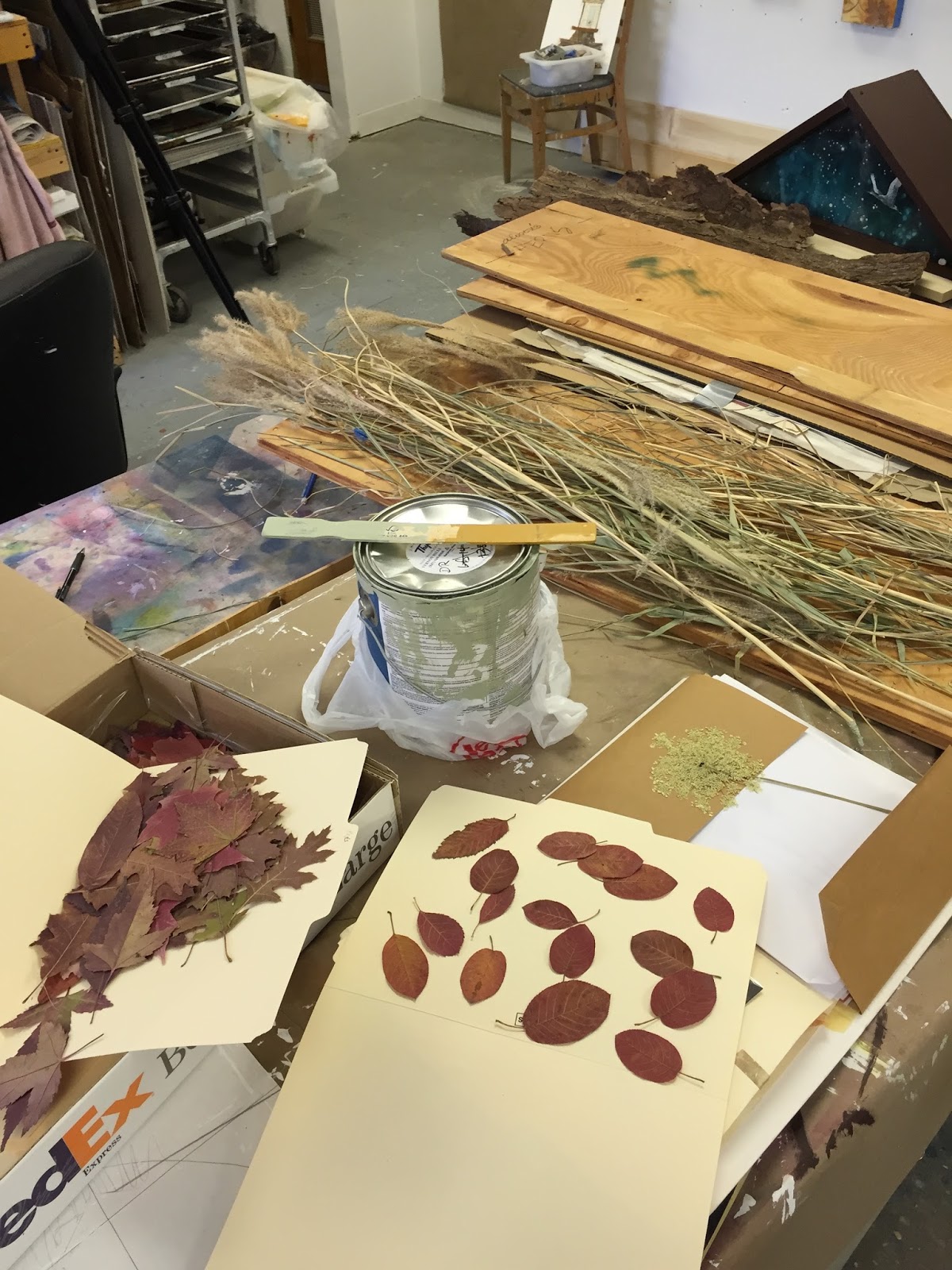
Then starting with paper patterns to scale to see how they'll work with the actual branches, nests, etc.


liking the top so far....


soem sense of scale- up to the ceiling! 


closeup of the top, with the night sky from the vernal equinox done in phosphorous pigments, a spring next woven of pussy willows with qualms eggs, Gothic shaped doors that will be inscribed with excerpts from  conservation classics....

working out the rest of the piece on graph paper


Now need a more fleshed out version for the jurors to look at...


 ...and here it is. I think I will be doing an overlay with little notes explain 
what each piece will contain. 


A small sampling of whats to be included:  beach rocks from Lake Superior, fall leaves, pods, altered book of relevant nature poetry that celebrates the midwest, a tree stump portion, spring peepers, red winged blackbird, queen anne  lace, fern fiddle heads, acorns, bark, moss, bracket fungus, summer grasses, and hibernating critters carved into a the winter base.  

PHEW! now- all i have to do is make it-and give it a title...any suggestions? toying with Mighty Midwest Totem. But perhaps altar is more fitting, or reliquary, or ?? open to suggestions.